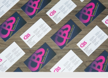
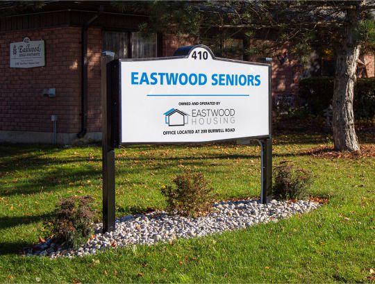
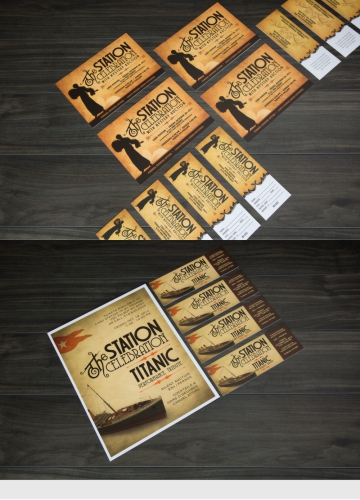
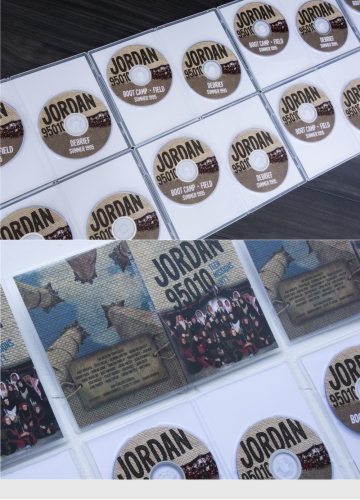
client:Office Plus
brief: The website for our parent company; a veritable hodge-podge of uses - providing access to online shopping, descriptions of their litany of services, and links to the printing and business services they provide. An all-in-one solution for a company with an all-in-one state of mind.


client: Employment Services Elgin
brief: The central repository for all things employment related within Elgin County. The site needed to serve as a resource library for job seekers, as well as providing them a central location to search for jobs - and find the tools necessary to prepare for them.


client: Easy-phone
brief: A brand repositioning for an established phone and internet service provider. The design needed to be eyecatching, fun, and reinforce the prospect of the ease of use of their service.


client: Axo Shredders
brief: An established seller of mobile shredders; Axo required brochures for each vehicle in their fleet to aid in the sales of their trucks. Each brochure needed to be custom designed to the vehicle to which it described, while remaining loyal to a pre-existing brand identity.


client: Chunity
brief: Logo design for a non-profit organization - the logo needed to express the idea of unity nad togetherness, while retaining a child-like quality; as the head of the organization is just 12 years old. Learn more about Children's Unity at www.chunity.org


client: Waterlogic
brief: A logo for an up and coming irrigation company in the St. Thomas and London area - the brand required construction from scratch; establishing the identity of the company - from logo to printed material, including their website.